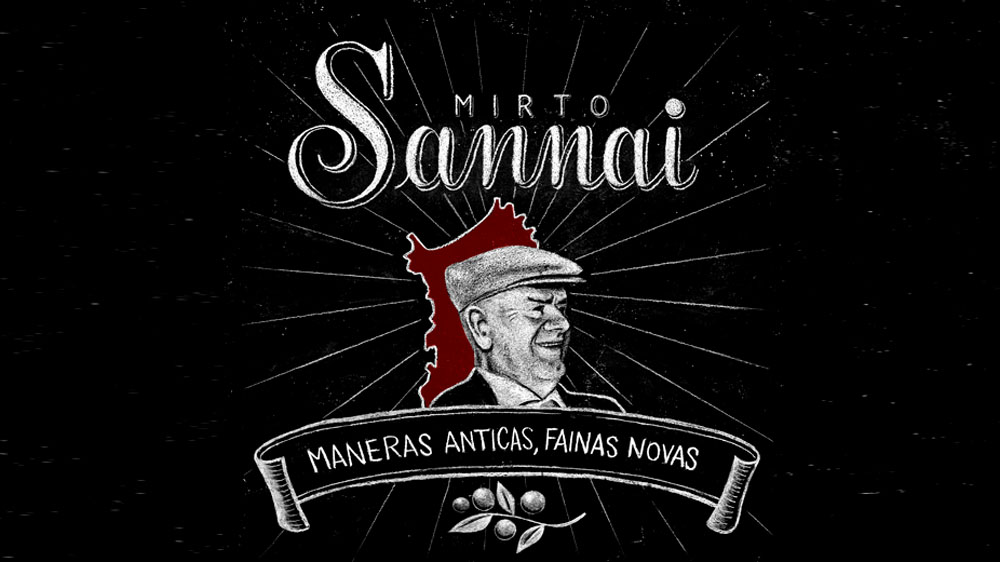
The logo

In nature there are billions of flowers differing in type, color and number of petals. They can often share a similar form or scent, and though there may be many similarities, one could never find two exactly alike.
As every animal, plant, or rock has its own recognizable characteristic distinguishing it in the world, each and every human being is as unique as nature intended. Recognizing and accepting diversity is the key to grasping the richness present in each and every person. This simple primordial secret is something that enhances us, our products, and our company.
The company name Sannai was created from the combination of the surname of the founder’s maternal grandfather, Giorgio Sanna, and also the road leading to the estate is called Sannai; it was only natural to give that very same, auspicious name to our little slice of paradise.
The logo which is designed entirely by hand is characterized by the image of the late Giorgio Sanna. Behind his photo lies the silhouette of the island of Sardinia. The contrast of the artwork’s antique flavor coupled with the modernity of the linear bottle and packaging emphasizes an ancient Sardinian adage written upon a scroll: “Maneras ANTICAS, fainas NOVAS”. This translates as “ancient methods in new products” or simply put “the old within the new”. This metaphor is very dear to us for two reasons: The first “tangible” reason is that the artisanal, handcrafted production of our mirto liqueur is the result of antique family recipes being passed down orally from generation to generation, while still continuously seeking innovation. The second “abstract” reason lies within the concept that the “old” or better yet “our elders”, are calling out to us in this age of consumerism where values are diminishing. We should remember the teachings of our grandparents and others who came before us, who sacrificed during extremely trying times, ultimately enabling us to enjoy the luxuries of today.